Posted on July 4, 2014
These Colors Don’t Run, But They Do Clash
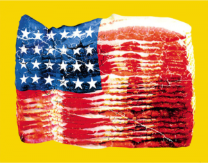 Yeah, I know George Washington didn’t ride up to Betsy Ross’ house and ask her to stitch the Stars and Stripes together. I know the Declaration of Independence wasn’t actually signed on July 4th. Yes, I’m aware that Independence day only celebrates when America declared its independence, not when it gained it. And I know about the War of 1812, thankyouverymuch. So let’s just not turn this into another one of those AH-HA! I’M SMARTER THAN YOU ABOUT ALL THE HISTORY THINGS kind of posts that you see everywhere these days. Because it’s not about that. This is about the America Flag. And modern color theory. And how awful the two can be when they meet.
A quick primer on color theory: No. I’m not going to do that. Instead, I’ll summarize with one sentence captioning a picture, and then you’ll know everything you need to know about it. And if you really want to know more, then go read this, if you must. Otherwise, just look at this and LEARN:

Ever wonder why getting yourself Spray Tanned Orange is a thing now? Like most horrible things, it’s because stupid people are imitating their favorites “celebrities” instead of ever having an original damn thought. You see, Orange sits on the opposite side of the Color Wheel from Blue. So, if you have anything that’s blue in your movie, like, oh I dunno, let’s say THE FREAKING SKY or something, then you make your actors orange. And that’s all you need to know about that.
All caught up on color theory now? Good, because I’m not going over it again. It’s time to start defacing sacred cultural iconography!
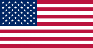
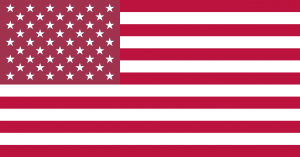
We start with the good old Stars and Stripes, in the familiar Red/White/Blue color scheme we all know and love. (Unless you hate America, or whatever. I have no beef with you, though. Please don’t blow me up or anything.)
Now, let’s apply a little Color Theory and totally screw things up for those of you who love America. (And I have no beef with you, either. Please don’t throw bullets or Bibles at me or anything.)
There are several different ways we can apply various color harmonies to the flag, and pretty much none of them are good. So let’s get some of the worst out of the way, right up front.
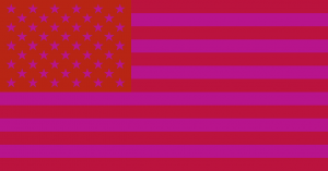
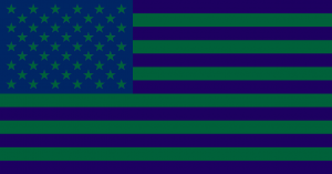
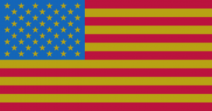
Using the standard shade of Red from the official US flag colors and applying an analogous color scheme to the flag is just awful. Don’t do it. You’ll make your eyes bleed (especially when you’re trying to color bucket 50 stars and the colors just keep merging and making your head swim and oh god I need all the aspirins.)
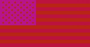
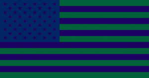
Doing the same thing with the official Blue as the base color is a little better, at least in the first option. The stars on the variation are just kinda sad looking.
Think that’s the end of it? Nooooooope! Let’s do some Split Complementary Blasphemy!
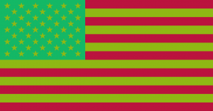
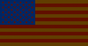
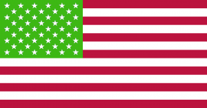
Using a Split Complementary color scheme with official Red as the base yields a flag at home in the North Pole, but on the North Pole of the Bizarro World, where Superman is evil and these red and green abominations are considered patriotic rather than the stuff of nightmares.
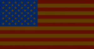
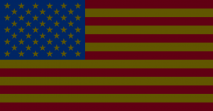
Much better results with blue again, although it mostly just looks like someone left a normal flag in the attic too long, and the rats have taken to sleeping and pooping and doing god knows what else all over it. But it’s got a kinda/sorta antique charm about it. I guess. If you go for that sort of thing.
Next up are the monochromatic flags. Not much to see here.
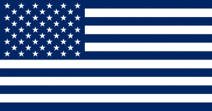
Maybe I’m just partial to blue, but it looks to me like blue wins again, in a minimalist/if-Apple-designed-flags sort of way. Although, to my untrained man eyes (that can’t see as many shades of colors as a woman’s eyes can because of, like, Science and stuff) the shade of red for the stars section of the Red flag looks a little blueish to me. But it’s not. I triple checked my Photoshoppery. It’s ust one of those optical illusion things, I keep hearing about, I think. Either that, or Sesame Street completely failed me as a child and I never did learn my colors. Let’s move on…
We’re almost done, and we’re starting to approach something halfway decent with the Triadic schemes.
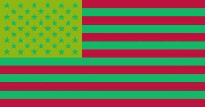
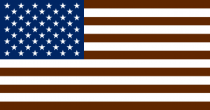
I think the Red wins this round. Finally. Although, now that I’m staring at them again, I’m not so sure. Both have the same element of stored-in-the-attic-too-long/rat-poop thing going on like we saw with Blue’s Split Complementary colors, but they’re both still pretty hideous. Let’s just put them down, go wash our hands, and move on to our last two flags.
The Complimentary colors!
Ewww. Seriously, that’s just plain stupid looking. I can’t even make a lame joke about it, because it’s just that awful. Hopefully, Blue can make up for the visual crime that Red has just committed here. Let’s see…
Much to my surprise, when using a Complimentary color scheme with official AMERICAN BLUE as the color base, you actually get something that’s basically just a slightly muted version of the regular flag we all know and love. It’s so close, in fact, that I think I actually prefer this version over the louder, brighter red. Because, seriously, if we’re being totally honest with ourselves, Independence Day is pretty much the tackiest of all the holidays. Muting the colors a little bit would go a long way to making your poor kids look less obnoxious when you obnoxiously dress them up in obnoxious red, white, and blue for obnoxious July 4th pictures that are obnoxious. Just sayin’.
So there you have it, America! Have a safe and happy July 4th, and let’s get on this calmer, smoother flag ASAP. Somebody get me the President on the line. We need to have a conversation.








You must be logged in to post a comment.